SPSathyasiddha Pattanaik See the impact
01Case studyBajaj Finserv Health

Wellness Store

Bajaj Finserv Health’s first e-commerce product. A wellness marketplace built from zero, with a B2B2C wallet as the hook.
Role
Product Designer, UX and UI
Team
PM, engineering, two vendor integration partners
Status
Phase 1 live, Phase 2 in development
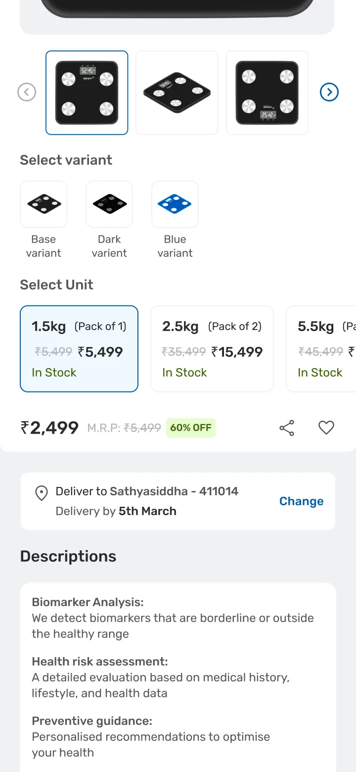
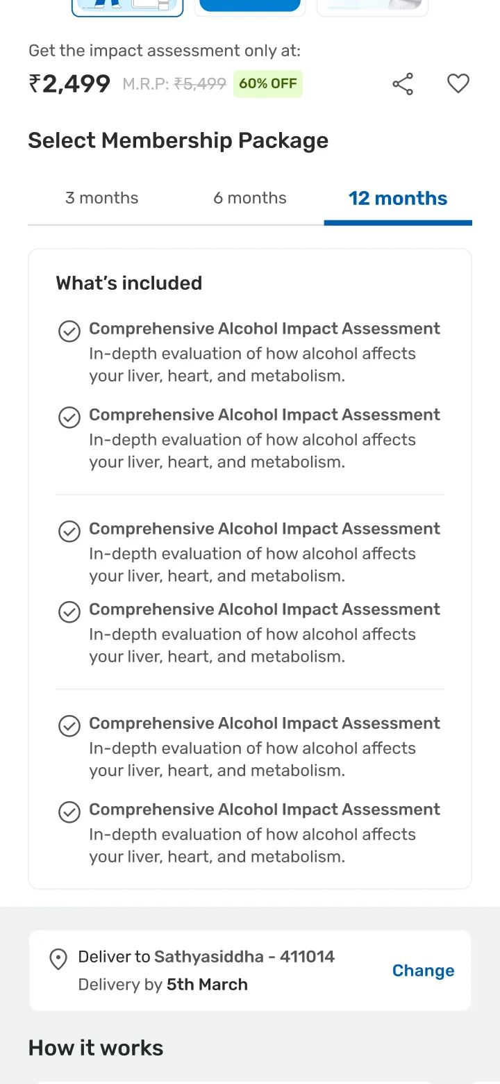
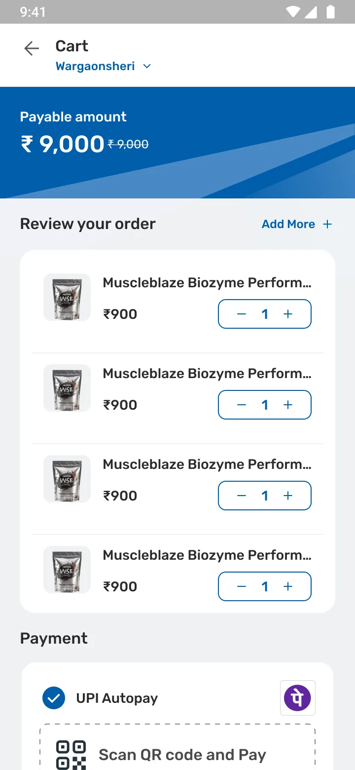
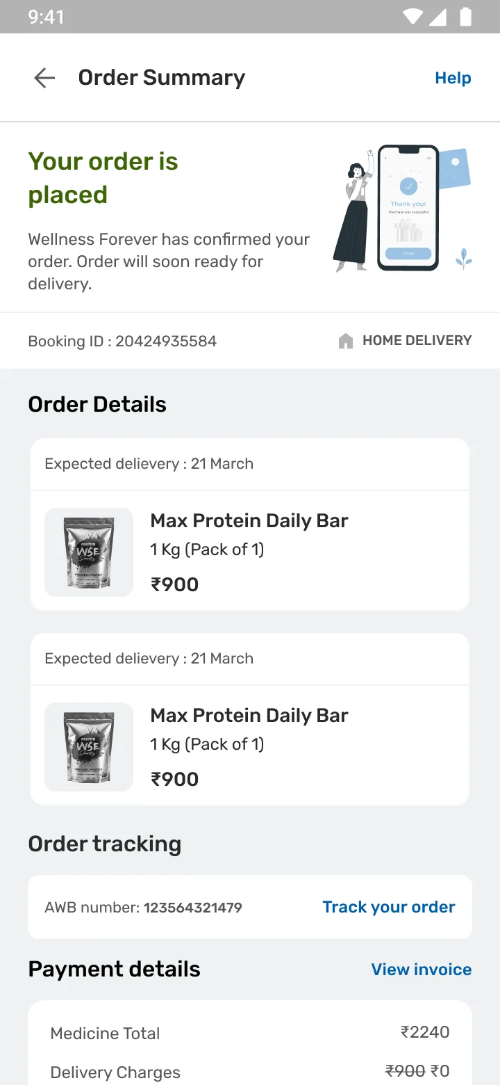
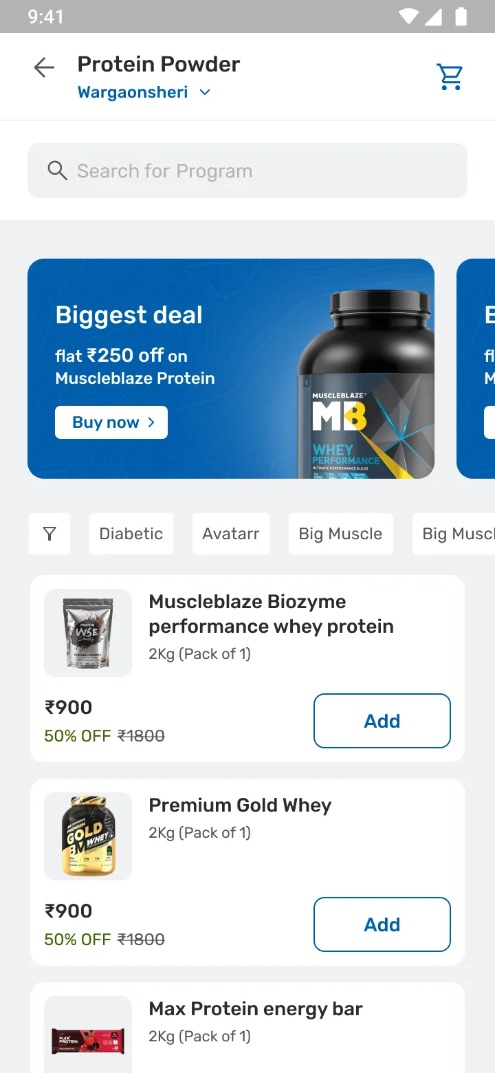
Home: wallet balance in the header above entitlement tiles. Listing: filter chips above product cards. Product page: variant swatches above a unit selector giving each pack size its own price and stock state. Program page: a Select Membership Package tab row above a What's included checklist. Cart: one payable amount over vendor line items with quantity steppers. Confirmation: order placed, with tracking and a payment breakdown.
01Overview2025 to 2026

An ecommerce layer, built inside the app that already existed.

Four product types in one build: supplements and smart devices alongside in-house programs and subscriptions.

  1. HomeWallet balance above entitlement tiles
  2. BrowseFilter chips above product cards
  3. ProductVariant and pack size
  4. ProgramMembership package and what’s included
  5. CartOne payable amount over vendor lines
  6. ConfirmedTracking and a payment breakdown

Year one at a glance July 2025 to June 2026 Measured

Full impact

Monthly revenue

~₹44K ~₹11.6L

Month one to the April 2026 peak.

~26× in nine months

~₹66L

Revenue

Year one, Phase 1 and 1.2.

26%

Margin

On ~₹17L profit.

~940

Orders

Across all four product types.

~₹37L

Top earner

A fitness membership tie-up. Programs led.

02Context and opportunity

Turning employer-funded wallet credit into wellness sales.

The platform
Bajaj Finserv Health’s app, on a healthcare design system with no PDP, cart or checkout.
The model
B2B2C. Members arrive through their employer’s Health Prime Plan carrying preloaded wallet credit and exclusive pricing.
The opportunity
Recapture wellness spend through the B2B2C wallet.

Three levels, each answering the one above it

Business
Recapture wellness spend through the B2B2C wallet.
Product
Carry the whole catalog through one familiar flow.
Design
  • Spend no interaction budget on novelty. Jacob’s Law: a marketplace PDP, a standard checkout, so recognition does the work.
  • Resolve four content models into one IA and one card system, so browsing never asks which kind of thing this is.
  • Keep the wallet’s value present at every decision point, first tile to confirmation.
03The problem

Supplements, programs, devices, vouchers. No one place to sell any of them.

There was no single place in the app to sell nutra supplements, its own health programs, wellness devices or vouchers.

The wallet made the gap visible. Credit was scoped to appointments and lab tests, so members held a balance with nothing else to spend it on. For supplements, devices and memberships, they went elsewhere.

Primary · B2B2C members

Employees on a Health Prime plan their employer bought. They arrive with preloaded wallet credit and exclusive pricing.

Also · GMC groups

Members covered under Group Medical Coverage, reached through the same plan structure.

Three barriers, each assigned to a design objective

  1. Too many optionsHold all four product types in one IA and one card system, so breadth never becomes noise.
  2. TrustLean on patterns members already know, so nothing about the mechanics of buying asks to be learned.
  3. PriceKeep the wallet’s value visible from home through confirmation, so the discount is never a surprise at the end.

Before the storeWhat was needed

Four product types, two sources. One marketplace inside the app.

Supplements · Smart devices · Programs · Subscriptions · Vouchers · Wallet for appointments and lab tests only

  1. SupplementsOne IA
  2. Smart devices
  3. ProgramsOne card system
  4. Subscriptions
  5. VouchersOne cart
  6. Elsewhere
  7. Wallet: lab tests onlyWallet credit

For supplements, devices and memberships, members went elsewhere.One cart, one checkout, and wallet credit that finally had somewhere to go.

04Constraints and complexity

Two constraints shaped everything that followed.

01 · No platform, no commerce patterns
The healthcare design system had no PDP, cart or checkout, and no vocabulary for quick-commerce or traditional e-commerce. Iterated toward commerce, not forked into a second system.
02 · An ASAP go-live
Reuse over custom builds. Vouchers as a fast-follow, not an MVP blocker. Personalization deferred. Designing to what engineering could ship was the job, not a compromise.

What one storefront had to hold

Product typeSourceLaunch
SupplementsVendor APIsPhase 1
Smart devicesVendor APIsPhase 1
ProgramsInternal CMSPhase 1
SubscriptionsInternal CMSPhase 1
VouchersBought with wallet creditPhase 1.2, a fast-follow

Four content models on two sources, several vendors in one cart, and a wallet that had to apply across all of it.

05Research and architecture

Two categories, studied for two different questions.

Traditional e-commerce

How people find and decide

The conventions a buyer already knows, and the depth a catalog is expected to have.

Quick-commerce

How people come back

Wellness restocking behaves like groceries. Speed, repeat and a cart that never leaves the screen.
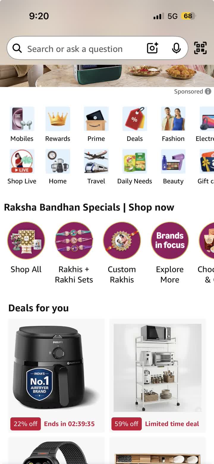
Amazon home: a search field with lens and voice input, a grid of category icons, a seasonal campaign row and a deals grid with discount and countdown labels.
Amazon · tookA category grid, not a carousel. That fixed the fold: entitlement tiles above a banner.
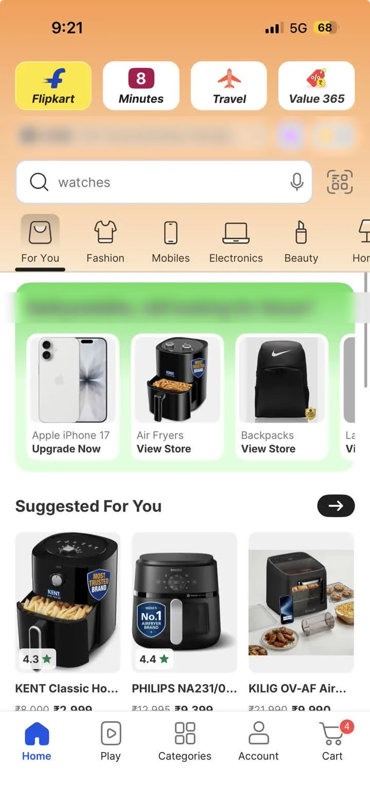
Flipkart home: service tabs across the top, a search field, a category tab row, a personalised continue-browsing shelf and a suggested-for-you grid with ratings and struck-through prices.
Flipkart · tookPrice, strike-through and rating on the card itself. The member price sits in the same slot.
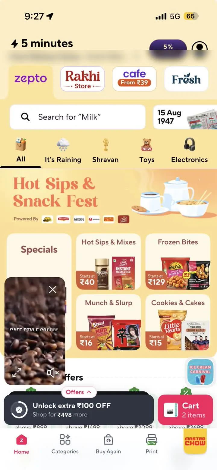
Zepto home: a delivery-time promise, store tabs, emoji category tabs, a campaign banner, category tiles each carrying a starting price, a persistent cart pill and a Buy Again tab.
Zepto · tookA price anchor on every tile and a Buy Again tab. Restocking is a different job from discovery.
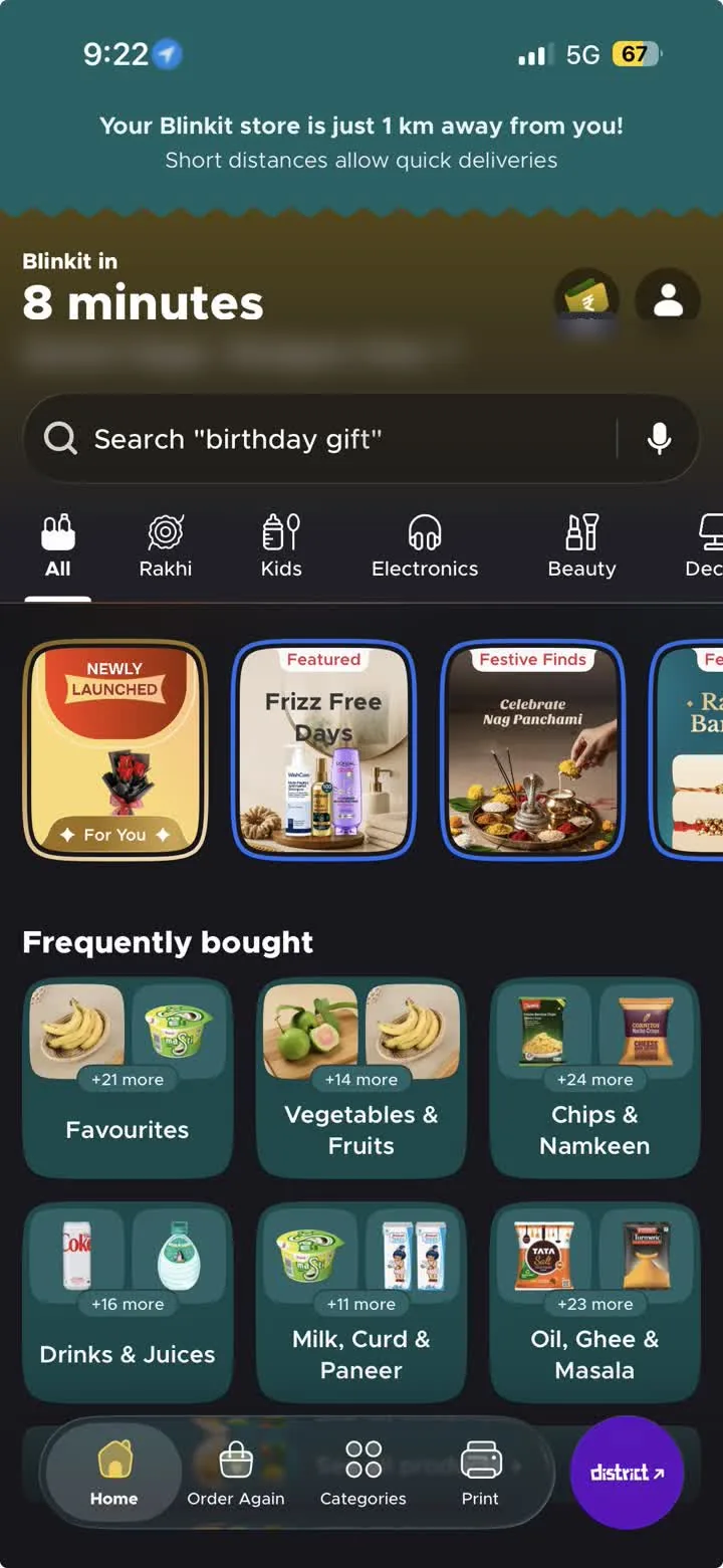
Blinkit home: a store-proximity banner, a delivery time in minutes set as the largest thing on screen, a search field and a category tab row.
Blinkit · adaptedDelivery time as the headline. We had no minutes to promise, so the header carries the balance instead.
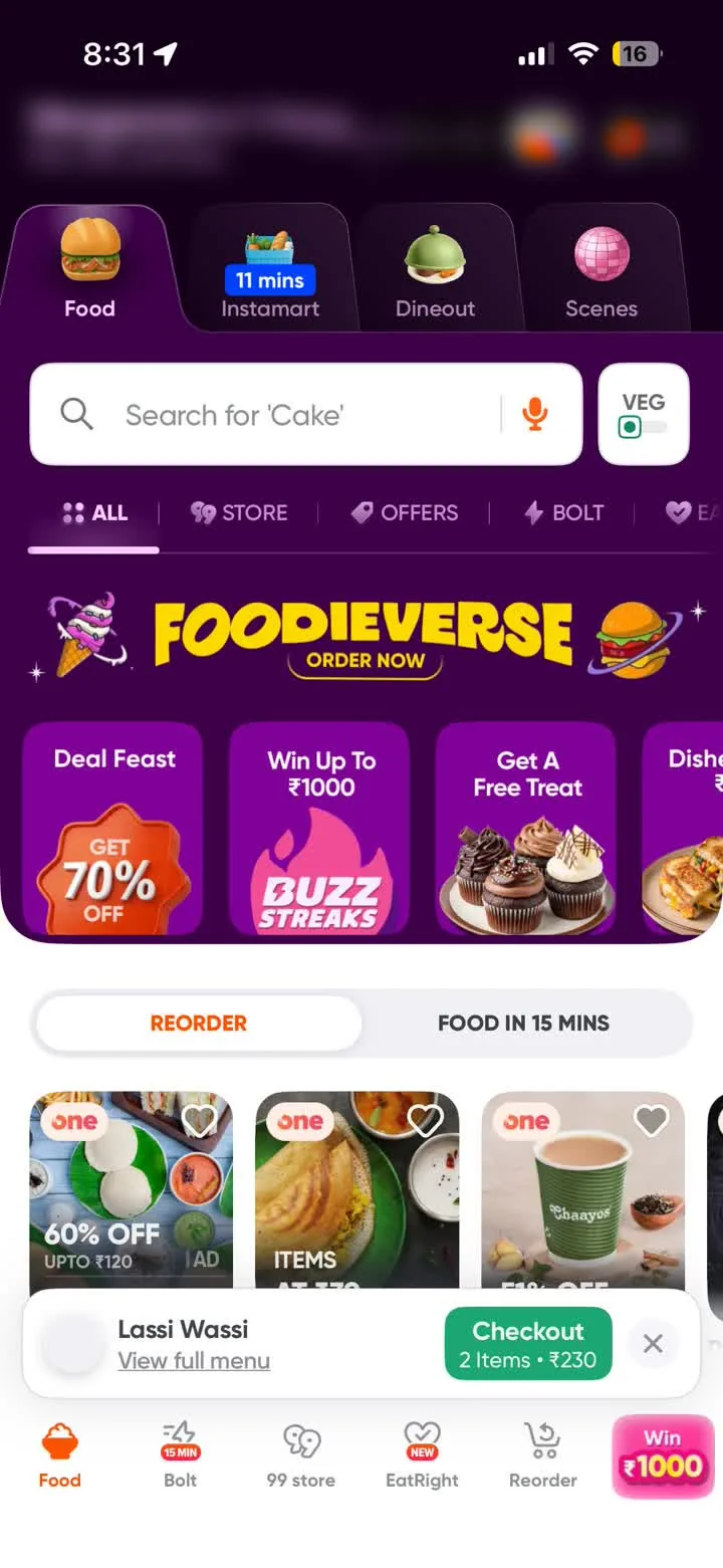
Swiggy Instamart: a mode switcher across Food, Instamart, Dineout and Scenes, a search field, and filter chips for store, offers and speed.
Instamart · tookOne app, several modes behind one switcher. The four product types sit under one card system for the same reason.

Wellness needs both: enough structure to choose a health program, enough habit to restock a protein tub.

Fig. 01 · The architecture

Two catalogue sources, one cart. The split never surfaces.

  1. Catalogue sources
    Vendor APIsSupplements · Smart devicesInternal CMSPrograms · Subscriptions

    Products come from vendor APIs, programs from an internal CMS.

  2. One card system
    One card systemFour product types, one visual language

    One card system over both sources.

  3. Two buying paths
    Add to CartVariant and pack size, stock from the APIExplore PlanTiers and duration, no SKU

    The paths differ in what they ask you to choose.

  4. One cart
    One cartReview and payment on one page

    One cart holds several vendors.

  5. Backend
    The splitProportional wallet credit, a sub-order per vendor

    The split the backend has to make never surfaces to the member.

Fig. 02

Phase 1 information architecture

Four tabs, one level of category, two detail types, one transaction path. Every screen in the journeys below sits somewhere on this map.

06Three key design decisions

Three calls, three consequences.

Decision 01

One store, two buying models.

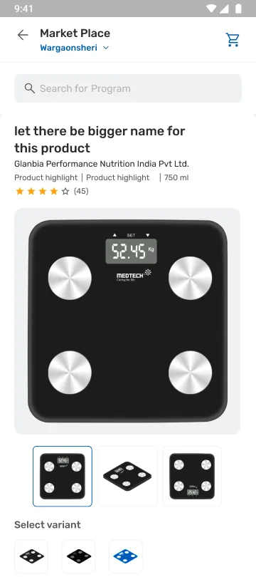
Product page: variant swatches above a unit selector giving each pack size its own price and stock state.
Add to CartWhich variant, which pack size
Program page: a Select Membership Package tab row above a What's included checklist.
Explore PlanHow long, then what that buys
Problem
Products come from vendor APIs, programs from an internal CMS, and the paths differ in what they ask you to choose.
Rationale
One card system over both. Same shell, two buying models: Add to Cart for products, Explore Plan for programs.
Result
The split shows below the fold. One asks which variant and which pack size; the other asks how long, then lists what that buys.
Value
A glucometer and a 90-day program coexist without the store feeling split.
Sub-flow
Voucher purchase, Phase 1.2: denomination replaces quantity, a structurally different PDP feeding the same cart and checkout.

Decision 02

Unified checkout over a split backend.

Problem
One cart holds several vendors, and the backend has to split wallet credit and create a sub-order for each.
Rationale
The member sees one order; the backend splits wallet credit proportionally into per-vendor sub-orders.
Result
A unified order ID over per-vendor sub-orders, with confirmed and delayed states designed in.
Value
The vendor split stays invisible through the entire post-purchase experience.

Decision 03

Wallet-first, everywhere.

The barrier was price: the discount should never be a surprise at the end. So wallet value stays visible end to end, not revealed at checkout.
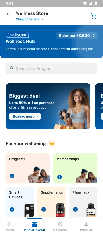
Home: balance in the header.
Home
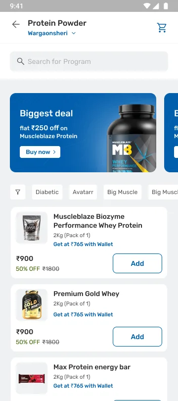
Listing: member pricing on the card.
Listing
Product page: member price beside the MRP.
Product page
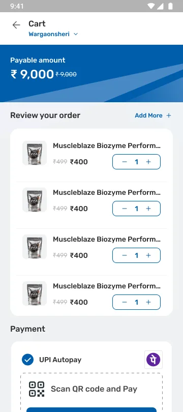
Cart: applied against the payable amount.
Cart
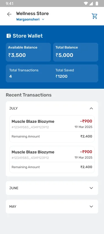
Store Wallet: available balance against total balance, total saved, and a dated transaction list.
Store Wallet
  1. Discovery · 01

    Balance in the header.

    A persistent header balance, from the first tile. Blinkit leads with delivery minutes; we had none to promise, so the header carries the balance instead.

  2. Discovery · 02

    Member price on the card.

    Member pricing on every card, in the slot Flipkart uses for price and strike-through. Two treatments were drawn: a plain Wallet Applicable flag, and the member price stated outright.

  3. Selection · 03

    Beside the MRP.

    On the product page the member price sits beside the MRP.

  4. Cart and checkout · 04

    Applied against the payable amount.

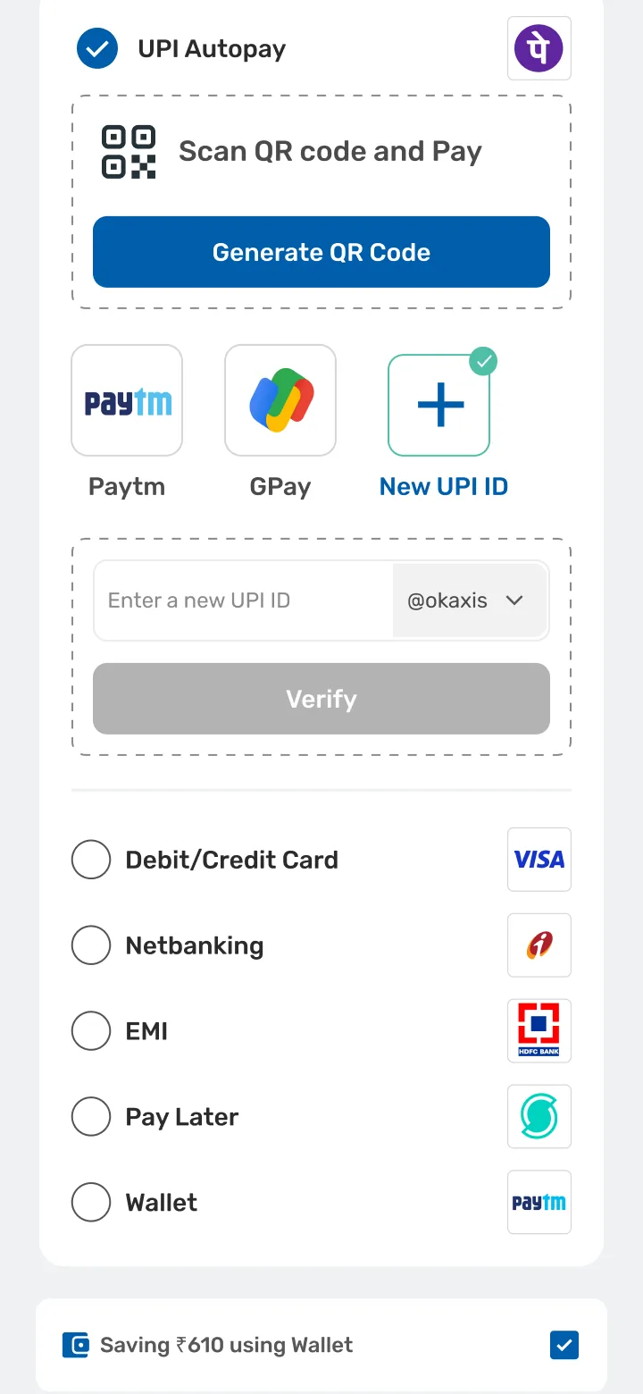
    Live total recalculation in the cart. At checkout, wallet, Health Coins and UPI combine, and each deduction is itemised at payment.

  5. After purchase · 05

    An account the member can audit.

    Behind them a Store Wallet screen: balance against allocation, total saved, every transaction. Not a discount that appears at the end.
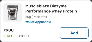
A listing card carrying a Wallet Applicable label between the pack size and the price.
Close upThe card, with the Wallet Applicable flag between pack size and price.
Value
Reframes the visit from “should I spend” to “I have credit to use”.
Also on
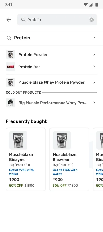
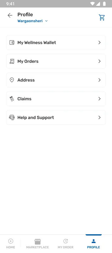
Profile, through the My Wellness Wallet entry, and search, where member pricing carries into frequently bought.
Profile: the My Wellness Wallet entry.
Profile
Search: member pricing carried into frequently bought.
Search

Interpretation The wallet is the B2B2C differentiator and the spine of the store’s value proposition. It launched late in Phase 1 and remains early-volume, a strategic bet rather than a proven driver.
07End-to-end journeysPhase 1 and 1.2, live

From the first tile to the delivered order.

Buying journey

  1. Home
  2. Browse
  3. PDP
  4. Cart
  5. Checkout
  6. Confirmation
Home: wallet balance in the header above entitlement tiles.
Home
Listing: filter chips above product cards.
Browse
Product page: variant swatches above a unit selector giving each pack size its own price and stock state.
PDP
Cart: one payable amount over vendor line items.
Cart
Checkout: the combinable payment method list.
Checkout
Confirmation: order placed, with tracking and a payment breakdown.
Confirmation
Designed
Four fixed entry tiles. One card system across product types. Two PDP models. Multi-vendor single cart. Combinable payment methods.
Decision
Same shell, two buying models. Add to Cart for products, Explore Plan for programs.

Order and post-purchase journey

  1. Confirmation
  2. Order summary
  3. Delivery states
  4. Saved addresses
  5. Reorder
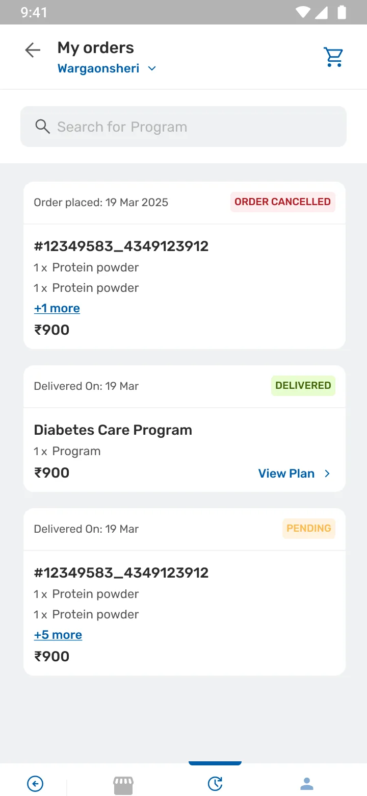
My orders: history showing delivered, pending and cancelled states against unified order IDs.
Order history
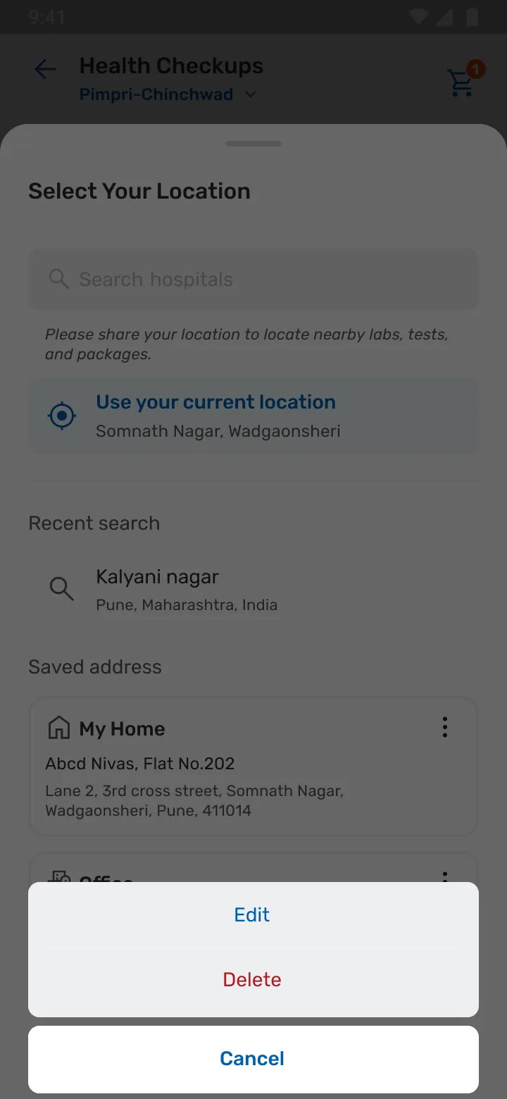
Saved addresses with an edit and delete action sheet.
Saved addresses
Designed
Unified order ID over per-vendor sub-orders. Confirmed and delayed states. Saved address management. Order history.
Decision
Designed the unhappy path, delayed and not just confirmed.
Achieved
The vendor split stays invisible through the entire post-purchase experience.
08What shipped

Two live, one in development.

  1. Phase 1 Marketplace LiveWallet balance in the header, entitlement tiles above the fold, four product types under one card system.The barrier was too many options, not too little inspiration, so the fold leads with entitlements, not a banner carousel.
  2. Phase 1.2 Vouchers LiveTiered vouchers bought with wallet credit. The PDP swaps the quantity stepper for denomination chips. The thing being chosen is a value, not a count.Adapt a gift-card pattern people already recognise, so the value is legible at a glance.
  3. Phase 2 Rebuilding trust In developmentBrand Pages: hero banners and curated merchandising the design controls, replacing a trust signal it doesn’t.Not shipped. See Phase 2 below.

Brief to shipped, in one loop.

  1. Problem statementNo one place to sell wellness
  2. Secondary researchTraditional e-commerce and quick-commerce
  3. PersonaOne member, three barriers
  4. Scenarios and edge casesEmpty, out of stock, delayed, no wallet
  5. Design and iterateReviewed against business and engineering
  6. Final outputShipped on the extended design system

Step 05 ran as a loop, not a stage. Feedback went back into the UX before anything was committed to final design.

Behind the scenes
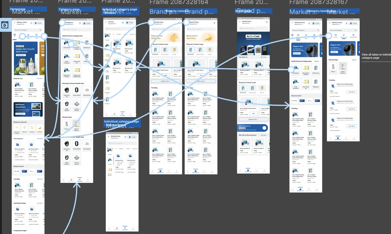
A Figma prototype view of the Phase 2 flow: frames laid out in a row with connection arrows running between them, several crossing back on themselves.
Prototype wiring for the Phase 2 flow. Every arrow is a route someone has to be able to take, and every one that crosses back is a dead end found before it cost anything.
A desk: a monitor running Figma, a laptop beside it, and an open notebook of hand-drawn wireframes with a pen across the page.
The fold gets settled on paper first. It is cheaper to redraw a hierarchy in a notebook than to argue with it in Figma.

Most of the work was smaller than a decision. Choosing a stepper over a chip. Extending a healthcare component instead of drawing a new one. Moving a balance eight pixels so it clears the wordmark. The three calls above are what survived; this is the middle they came out of.

09Business impactJuly 2025 to June 2026

What Phase 1 and 1.2 did, July 2025 to June 2026.

Measured a business figure for the period Interpretation a reading of what it means

~₹66L

Revenue in year one Measured

Phase 1 and 1.2.

26%

Margin Measured

On ~₹17L profit.

~940

Orders Measured

Spread across all four product types.

Fig. 03 · Monthly revenue, ₹ lakh Measured

The store opened at roughly ₹44,000 in its first month and climbed slowly through autumn, flattening around ₹4L while the catalog and vendor integrations scaled. It accelerated sharply from February, more than doubling in two months to a peak of about ₹11.6L in April 2026, then softened for three consecutive months, falling back to ₹4.2L by June. That fall is what Phase 2 was designed to answer. July 2026 is a partial month and is not plotted.
Wellness Store monthly revenue, in lakh rupees (₹L)
MonthRevenue (₹L)
July 20250.4
August 20252.2
September 20254.2
October 20254.0
November 20254.3
December 20253.4
January 20263.8
February 20266.3
March 202610.5
April 2026 (peak)11.6
May 20269.4
June 20264.2
Revenue ~₹66L
Year one, Phase 1 and 1.2.
Profit ~₹17L
A 26% margin.
Orders ~940
Spread across all four product types.
Growth ~₹44K → ~₹11.6L
Month one to the April 2026 monthly peak.
Top lines ~₹37L / ~₹19L
A fitness membership tie-up, then Diabetes Care. Programs and memberships were the strongest earners.
Current pace ~34% ahead
Early July tracking ahead on GMV. A partial month, so it is not plotted on the curve.

Interpretation On attribution

Revenue reflects catalog, pricing and marketing alongside design. Design supported this outcome; it did not solely cause it.

  • Orders spread across all four product types read as the one-IA objective holding in practice, not only in Figma.
  • The wallet remains the strategic bet, still early-volume, with today’s performance overwhelmingly direct sales.
  • These say the store works as a business. They do not isolate design. No design objective was instrumented, which is what the last section asks for.
10Phase 2In development

When the input cannot be fixed, change what carries the trust.

  1. Observed

    Revenue peaked in April, then softened for three straight months.

  2. Hypothesis

    Inconsistent, low-quality vendor photography was eroding trust at the point of decision.

    The catalog arrived through vendor tie-ups, so the imagery was never the design team’s to control, and chasing vendors for better images was neither fast nor reliable.

  3. Proposed

    Brand Pages: brand-owned banners, curated collections, shop by concern, shop by product type.

  4. Not yet validated

    Ship Phase 2 and measure whether the trust fix reverses the softening.
Trust and discovery In development

  1. Home
  2. Category
  3. Sub-category
  4. Shop by concern
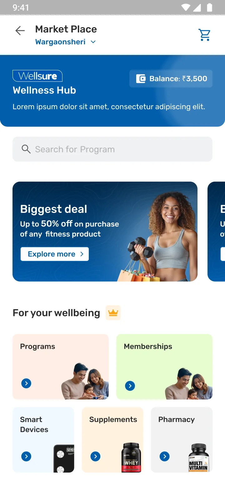
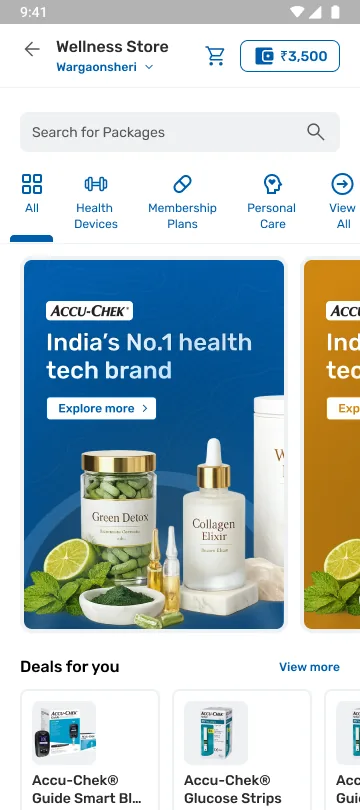
Phase 2 home: category tabs across the top, a brand banner, and a deals row beneath.
Home
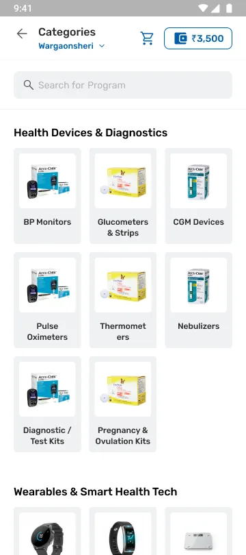
Categories: Health Devices and Diagnostics as a tile grid of BP monitors, glucometers, CGM devices and test kits, with Wearables and Smart Health Tech below.
Category
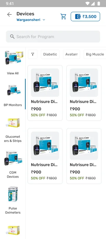
Devices category: a left-hand category rail beside a filtered product grid.
Sub-category
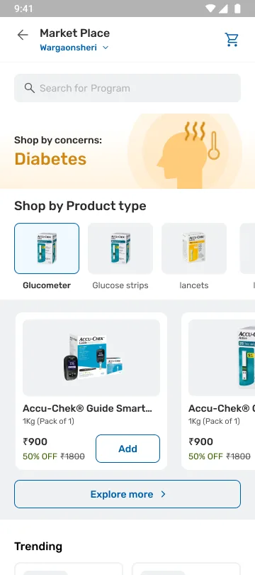
Shop by concern: a Diabetes header over Shop by Product type filters, product cards and a trending row.
Shop by concern

Brand page, in full

The end of the journey and the whole point of it.

The banner, the product lineup and the discount bands are merchandising design controls, sitting where an unreliable vendor photograph used to carry the decision.

It doubles as a browse surface: shop by product type, top deals, curated rows. One page answering both trust and discovery.

Intent
Brand identity carries the trust an unreliable photo cannot; the same pages double as browse surfaces.
Trade-off
Brand Pages add an IA layer, a real trade-off, in exchange for a fix that does not wait on vendors.

The org prioritised it into development. It has not shipped, so there is nothing here to claim.

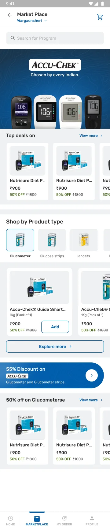
Brand page in full: an Accu-Chek hero banner with the product lineup, a Top deals row, Shop by Product type filters for glucometer, glucose strips and lancets, product cards with an Add action, an Explore more link, a 55% discount band and a 50% off row, above the bottom tab bar.
11What I learned

What this project changed in how I work.

  1. Deconstruct the design system before extending it.

    I had to take the DLS apart component by component to see what could carry commerce and what had to be rebuilt. Extending a system I had not pulled apart first would have been guesswork, and the guesses would have shipped.

  2. Iterate toward what people already know.

    User feedback kept pointing at familiarity rather than novelty. Each round told me where people expected something they had seen before, and the flow got simpler every time I listened to that.

  3. Keep the seams on the inside.

    Four content models, several vendors and a split payment were never the member’s problem. One card system, one cart and one order ID kept the vendor split invisible through the entire post-purchase experience.

  4. Annotate, and hand over the assets with it.

    Annotating every screen and shipping an asset file alongside it did more for delivery than any handover meeting. It made the work easier for me and for the dev team, and it took most of the back and forth out of the build.

  5. Design to what can ship.

    The ASAP go-live made reuse the brief: vouchers as a fast-follow, personalization deferred. Designing to what engineering could ship was the job, not a compromise.

12Next steps

What would settle it.

  1. 01Ship Phase 2 and measure whether the trust fix reverses the softening. That is the direct test of the diagnosis, and the only thing that will settle it.
  2. 02Grow wallet adoption, the clearest lever for the loyalty goal the store was built for, and still the early-volume part of the business.
  3. 03Instrument the design objectives, so future changes are validated rather than reasoned about.
  4. 04Extend into AI-driven personalization, building on the rule-based personalization already live.
Phase 2 home: category tabs across the top, a brand banner, and a deals row beneath.

Phase 2 home · in development